Marian's Dream
A Website Transformation & Responsive web design [ Case Study ]
Overview
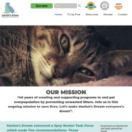
Marian’s Dream was launched in 1981 with the goal of ending pet overpopulation through public education campaigns, systemic change, and the development of infrastructure. Thanks to Marian’s Dream and other grassroots pet lovers’ groups, the number of cats/dogs that were being euthanized by U.S. shelters annually has fallen from about 12 million then to about 2 million now.
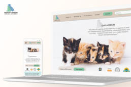
We believe we could improve the experience of users on mariansdream.org by updating the website with a more intuitive page layout and easily-accessible information and optimizing the site for mobile browsing by applying mobile-first RWD principles.
Challenge
The information on the website was outdated and not easy to access; moreover, it was not optimized for mobile browsing:
- Outdated Website
- Need for a Responsive and Mobile-Friendly Website
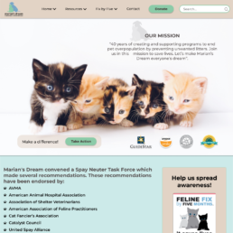
Solution
Our solution primarily focused on updating the content, the information architecture, and the UI (Mobile-First Responsive Web Design):
- Update the Website
- Responsive Web Design
Impact
-
Average Visit Duration, up by 20%
-
Site Traffic, up by 10%
-
Satisfied Stakeholders
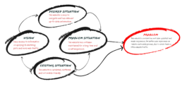
Problem Statement
Methodology
Defining the Challenge
- Stakeholder Interviews
- Heuristic Evaluation
- User Persona & Empathy Mapping
Research & Analysis
- User Interviews
- Analysis of the Findings [Affinity Diagram & Priority Matrix]
Designing
- UI Style Guide
- Information Architecture
- Prototyping - Sketches, Mid-Fi & Hi-Fi
Validating
- Usability Testing
- Iterations

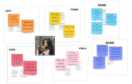
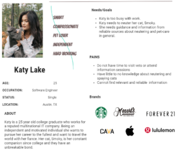
User Persona & Empathy Mapping
We created a USER PERSONA, Katy Lake, in order to understand the needs of users looking for resources and guidance on spaying/neutering their pet cats. This allowed us to understand the pain points our typical users experience.
We utilized an EMPATHY MAP to visually express and understand what we know about our target users. This helped us greatly with our decision making process.
Defining the Challenge
We conducted extensive stakeholder interviews and heuristic evaluations of the web pages to understand the full scope of the project. After gathering all the data, we brought to life our user persona, Katy Lake, to further explore our users’ pain points.
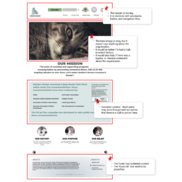
Heuristic Evaluation
We performed a heuristic evaluation on the site to test if the site is user-friendly. Red-lined annotations note areas for improvement on the page. We evaluated the homepage as well as several other pages for this purpose.
Stakeholder Interviews
Stakeholder interviews helped us gather information which helped with our design process. It helped define the success metrics as well as overall stakeholders' expectation regarding the final outcome of the website-redesign.
Research & Analysis
Studying similar non-profits (pet advocates and providers) and their users helped us understand the community and individual users better.
User Interviews
In order to design a better user experience, we first have to study our users’ process of searching for information regarding 'spaying/neutering of cats' both online and in person. We interviewed 8 people. This helped us better understand our users' experiences, pain points, behavior, and perspectives.
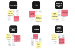
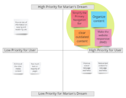
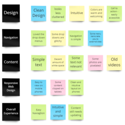
Analysis of the Findings [Affinity Diagram & Priority Matrix]
We gathered all the data from the user interviews and sorted them under common affinities. The AFFINITY DIAGRAM gave us a big-picture view of our users' experiences and behavior.
Then the main user concerns were analyzed and sorted into a PRIORITY MATRIX, ie. high priority vs. low priority. This helped us understand which feature redesigns would have the most impact on the end user and deliver the most value to the stakeholder.
Designing
After creating a refreshed UI style guide, we started the prototyping phase. Starting from rough sketches, we broke down and build up our assigned web pages. This gave the UI the much-needed update, making it sleek, simple, and easy to navigate.
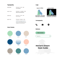
UI Style Guide
We studied the ‘Marian’s Dream’ brand style to see how effective it was in communicating its message to users and made minor changes based on our test data analysis and our mood boards. Then a UI STYLE GUIDE for the website redesign was created to aid us in the prototyping phase.
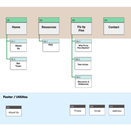
Information Architecture
Based on all the feedback, we did a closed CARD SORTING exercise to come up with a simpler and improved INFORMATION ARCHITECTURE. This helped to group and organize information better and ultimately reduce clutter, improve navigation, and provide a better user experience.
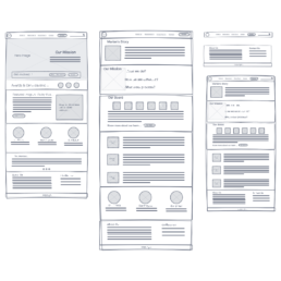
Sketches
We began by sketching LOW-FIDELITY wireframes – our team utilized paper as well as digital sketches. In the early stages of the prototyping process, sketching helped to visualize the problem and explore the best suitable design solutions.
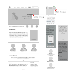
Prototyping - Mid-Fi
After we had finalized our basic design concepts based on our user feedback and sketches, we created interactive MID-FIDELITY prototypes for mobile and desktop. Keeping our user’s primary pain points in mind (Cluttered layout, difficult navigation, and outdated content) we made design changes and did a round of USABILITY TESTS.
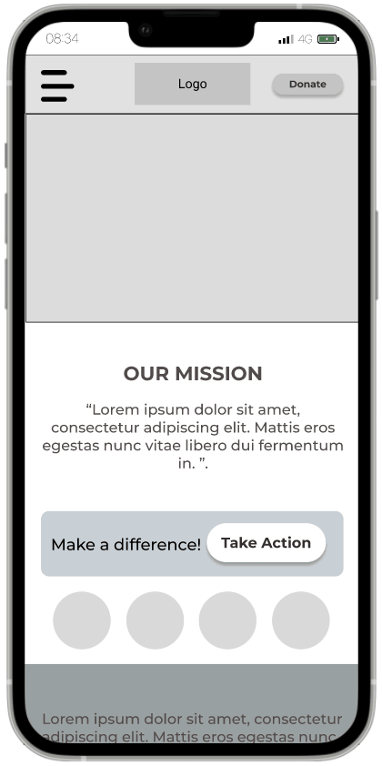
Prototyping - Hi-Fi
After analyzing the usability tests on our mid-fi wireframes and iterating them to incorporate the findings, we moved into the next step in our design process – HIGH-FIDELITY prototyping. We went through several iterations of our hi-fi prototypes and ran USABILITY TESTS on each version before we settled on our final web page design.
Validating
We received positive feedback from the stakeholders and users who tested out our prototypes and their iterations. Finally, our design was fully validated and developed with minor changes to the content.
Usability Testing
Our team did 6 usability tests to gain insights on 3 redesigned user flows: Finding resources on spaying cats, why ‘fix by five’, and completing a donation. This feedback helped us to gauge the redesigned homepage’s effectiveness in communicating MARIANS DREAM’s message to the user and to optimize user engagement.
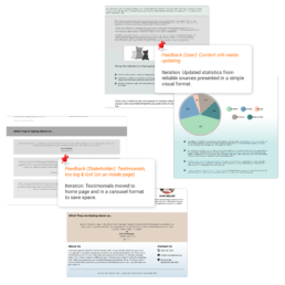
Iterations
Although we had a lot of positive feedback from our usability tests, we identified some opportunities for improvements as well. After minor iterations which incorporated solutions to the user concerns (from Hi-Fi prototype testing), the stakeholders were fully satisfied. The website redesign was finalized!
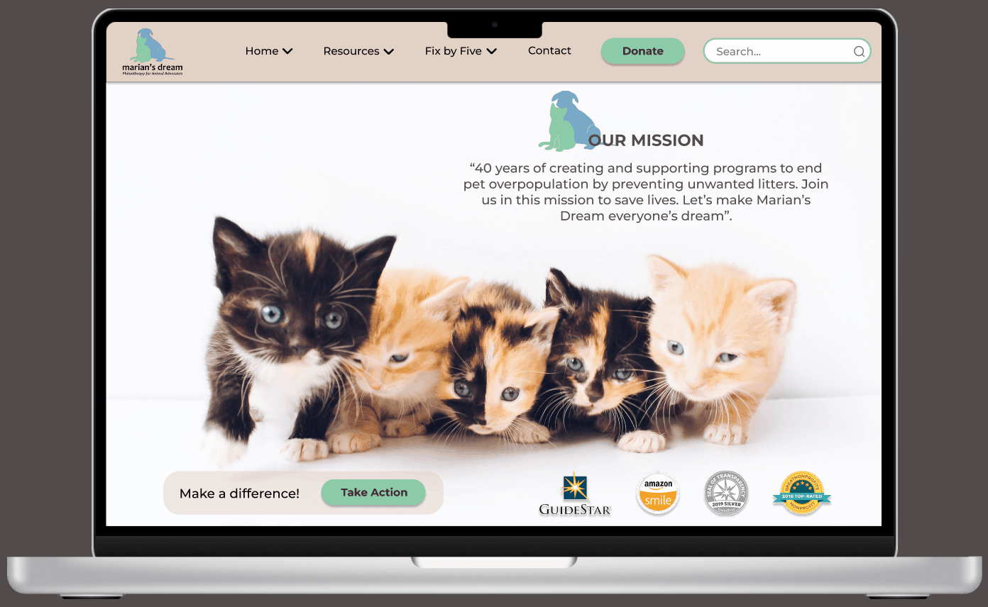
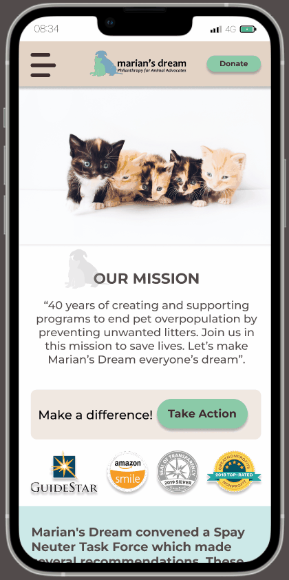
Before / After
The Impact
Better User Experience
The Average Visit Duration was up by 20%
Users were more engaged with the content as they were able to find relevant information quickly and easily.
Increased Site Traffic
The Website Traffic was up by10%
Marian's Dream saw an increase in website traffic due to the update and a responsive design that made the website more accessible to mobile users.
Satisfied Stakeholders
The stakeholders were very pleased with the redesign and appreciated the value added, ie. more site traffic and a renewed interest in their cause.
Esther Mechler, founder Marian’s Dream
Our organization found Sandy (UC Dezines) through a third party, who recommended her – and we have been very pleased with her work. Our original need was for help with making a PowerPoint more professional and attractive. Sandy created a beautiful look for the PowerPointand went on to show us some of her portfolio which included entire packages of promotional materials and even a pitch for a company that she invented. She has also worked on websites and landing pages for our organization. The look and organization of her materials is excellent. We feel we have found a gem in UCDezines and recommend them highly.
Let's connect and create something amazing!
Socialize
Contact
Thanks for visiting.